
Website Redesign Case Study: Improving the Checkout Experience for a Bouncing Castle Rental Website
A website can offer great products and services, but if the booking process is confusing or difficult to navigate, potential customers may abandon their purchase before completing it.
For businesses that rely on online bookings, user experience (UX) plays an important role in turning website visitors into customers. A clear layout, intuitive navigation, and straightforward checkout process can make the difference between a frustrating experience and a successful booking.
At OZC, we redesigned the checkout experience for Verleih Hüpfburgen, a bouncing castle rental website, with one primary goal: make the booking process easier, clearer, and more user-friendly.
This case study explores how thoughtful UI/UX design can help improve the customer journey and create a smoother online booking experience.
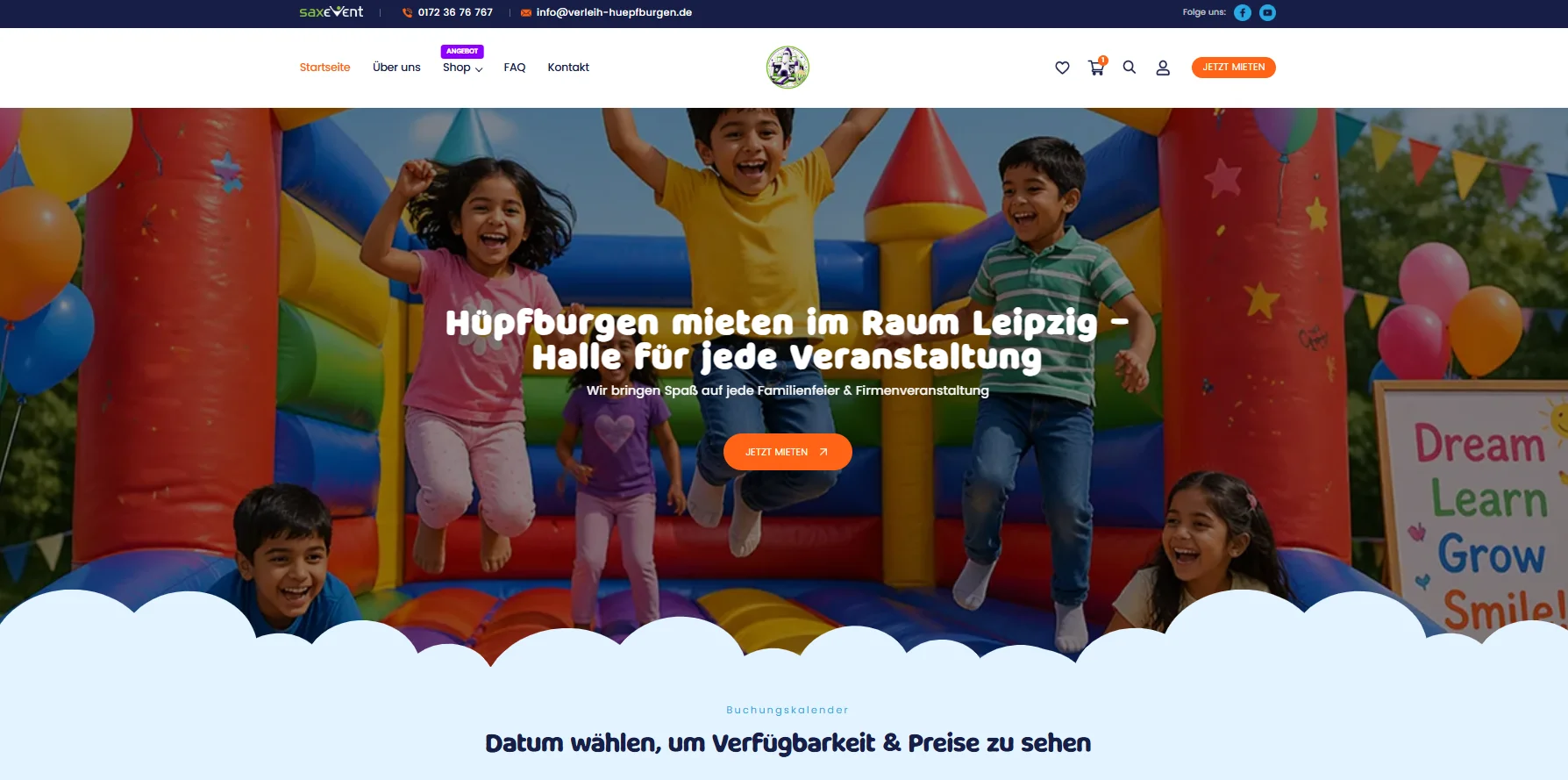
| Take a look | Old version | New version |
|---|---|---|
| Banner | 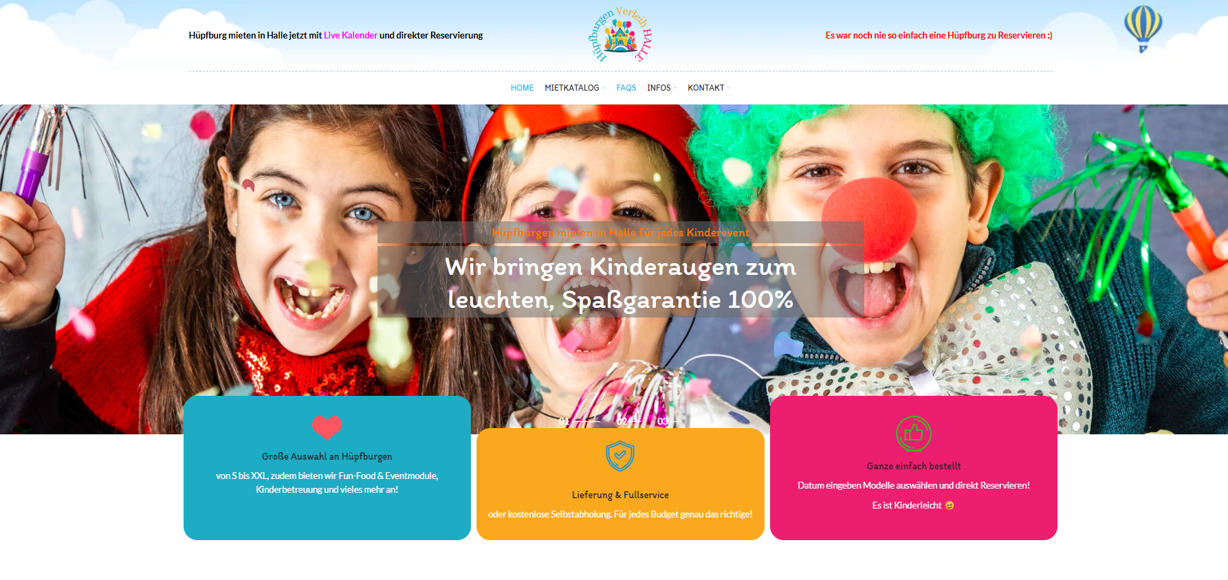 |
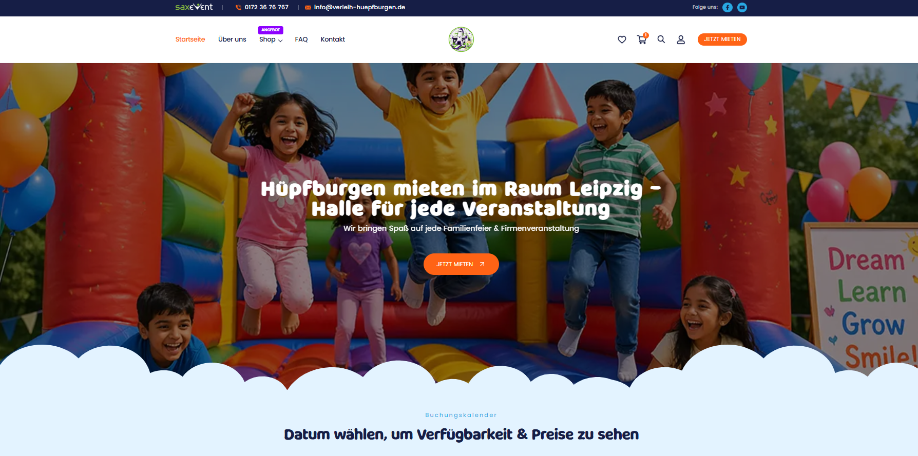 |
The Challenge: Making Online Booking Easier
When customers rent a bouncing castle, they need to feel confident that they have selected the right product and can complete their booking without unnecessary complications.
The challenge was to improve the checkout interface so customers could navigate the process more comfortably and understand what they needed to do at each step.
Our Approach: Redesigning the Checkout Experience
Rather than changing the interface purely for visual appeal, we focused on making the checkout experience more practical and intuitive.
1. Simplifying the Layout
We refined the checkout interface to create a cleaner, more modern appearance, helping important information and actions stand out more clearly. Reducing visual clutter allows users to focus on completing their booking instead of figuring out how the page works.
| Take a look | Old version | New version |
|---|---|---|
| Easier for users to put product in the cart | 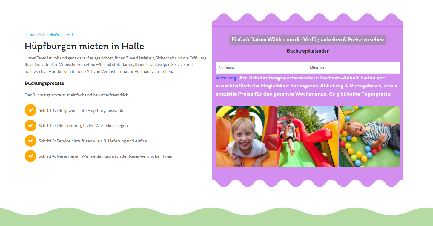 |
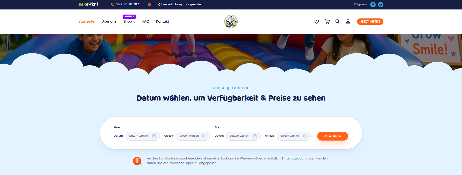 |
2. Improving the User Flow
A good checkout process should guide customers through each step with minimal confusion.
We focused on creating a more logical user journey, making the booking experience feel more straightforward and easier to follow.
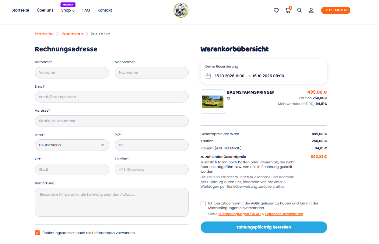
Before and After: Small Design Changes, Better Usability
The before-and-after transformation demonstrates how a more structured layout and a clearer checkout experience can improve the way customers interact with a website.
The Verleih Hüpfburgen project highlights an important principle of web development: a successful website should work as well as it looks.
Businesses often focus on attracting visitors through marketing and advertising, but the experience after a visitor arrives is equally important.
If customers struggle to navigate the website or complete a booking, the business may lose opportunities that it has already invested resources to generate.
Looking to Improve Your Website's User Experience?
At OZC, we believe that effective web design combines visual quality with practical usability. From refining individual checkout flows to developing tailored website solutions, our focus is on creating digital experiences that support both customer needs and business objectives.
Whether you operate an online store, a rental platform, or a service-based business, improving the customer journey can be a valuable step toward building a more effective website.
Visit Verleih Hüpfburgen to explore the project, or visit OZC to learn more about our website development work.
Better design is not just about how a website looks. It's about making every interaction easier for your customers.
How Regulatory Changes Affect Business Software
Case Study - Bouncing castle rental website
What should we consider when choosing a CMS for our website?
